Acquire an eagle's view of your organization's Performance with Accoxi's Dashboard.

A Business dashboard is an analytical tool that visually tracks, analyzes, and displays key performance indicators (KPI), metrics, and key data points to monitor the health of a business, department, or specific process. They provide valuable insights into your organization's performance.
Accoxi's dashboard provides an eagle's view on an organizations business by providing us an insight on the organization's KPIs and other metrics that can analyze performance of the business. This video is a tutorial on how to navigate and have an understanding of the business Dashboard in Accoxi.
Key Features of Dashboard;-
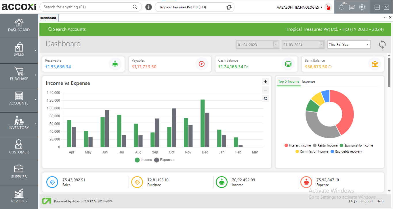
When the user log in to the Accoxi, dashboard will be open as the home page. It consist of various menus and shows the current status, details of income and expenses of the business organization.
|
Fields |
Description |
|
Search Accounts |
Search Account is an important tool in Accoxi that allows the user to search accounts or access transactions without selecting the Accounts Module. When the user opens the Accoxi account, the Search Accounts option will always appear on the top left side below the title bar.
By clicking on Search Accounts Menu, the Accounts Search Page displays all types of transaction details here. It shows the transaction date, transaction type, ref no, debit ledger, credit ledger, amount, and the status of each and every transaction.
It helps the user to access data or the function in a jiffy. The ledger details of the transaction can be viewed by clicking on the + menu on the left side of the tab.
|
|
Time Filter |
The filter option at the top right corner grants users to filter the dashboard values on a time frame basis like today, weekly, monthly, quarterly, previous month, previous week, previous quarter, and custom where Accoxi provides the user to choose dates on the user's requirements. |
|
Cash Balance |
It shows the Cash Balance details of the organization.
When the user clicks on the Cash Balance menu, a new tab will be displayed, showing the current cash balance of your business.
|
|
Bank Balance |
This menu will help the user to identify the balance of bank alongside the current details of bank balance.
When the user clicks on the Bank Balance menu, a new tab will appear with multiple bank balance details of the user.
|
|
Receivables |
It shows the amount of receivables from the customers. When a user clicks on the Receivables, it takes the user to the accounts receivable ledger.
|
|
Payables |
It shows the amount of payables to the Suppliers. When the user clicks on the menu, the user gets redirected to the Accounts payable ledger.
|
|
Refresh |
If the latest data is not displayed, click on the refresh icon on the top left corner of the page to fetch the new data.
|
|
Income/Expenses Graph chart
|
The dashboard shows a column graph chart which represents the comparative study of the Income and Expenditure of the firm over a particular period of time. |
|
Sales |
It shows the sum total amount of total sales of the organization. When the user clicks on the Sales menu, it opens to Sales Invoice Page in Sales Module. |
|
Purchase |
It shows the total amount of total purchases of the organization. When the user clicks on the Purchase menu, a Purchase invoice page in the Purchase module opens. |
|
Income/Expenses Pie chart
|
The pie chart in the dashboard shows the top 5 incomes and expenses of the business organization. Users can access the details of income and expenses separately as two options or as one as required.
Users can select the required time period for the Pie chart from the menu available. It includes various options and the user can select the required one. Once the user selects an option, then a chart of Income & Expenses will appear on the basis of the selected date.
The income chart shows the top 5 items of income along with amounts displayed in various color formats. The expense chart shows the top expenses incurred by the business along with its amount in various color formats. |
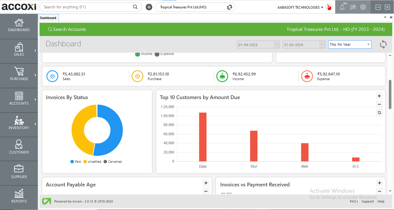
Invoices by status displays the status of the sale invoices as paid, unsettled, unpaid, and canceled. The status will be color coded accordingly. While clicking the required status the user will be redirected to view a breakdown of the following invoices under the status of the invoice.
Top 10 Customers by Amount Due shows the top 10 graph of customers whose amount is due and need to be paid to the organization.
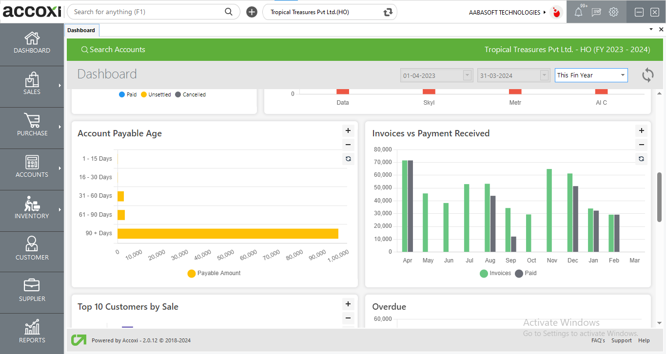
The accounts payable age graph depicts the payable amount the organization has to owe to the suppliers. The graph describes the amount due in various time frames to provide a clear-cut analysis of the payables of the organization. While clicking on the graph, the user gets a breakdown analysis of the payables during the particular time frame.
Invoices VS Payment Received graph portrays monthly invoice amounts generated to the payments received through invoices from customers. This displays the aggregate value of the invoices with respect to the payment received from the invoices generated hence giving a crystal clear understanding of company financials.
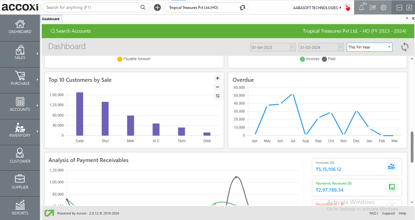
Top 10 Customers by Sale graph describes the top 10 customers of your organization and the amount they have contributed to sales. This shows the organization's best customers that have helped generate income for the organization.
Overdue is a line graph depicting monthly analysis of receivables or amount due by the customers. The receivables of each month will be depicted in this graph.
Analysis of Payment Receivables graph compares the trajectory of payments received from customers such as opening set off customer advance payment and invoice payments with respect to invoices only is shown in the Analysis of Payment Receivables.
Invoices show the total amount of all value of invoices (not deducting sales return) created for the customers.
Payments Received displays the total value of payments received consisting of invoice payments, customer opening set off, and customer advances.
Receivables amount is calculated by deducting invoices with payments received.
Receivables Percentage is calculated with respect to the aggregate invoice value.
User can access the cash balance details by clicking on the cash balance option in the dashboard. It shows the Cash Balance details of the organization.
When the user click on the Cash Balance menu, a new tab will open which details the current cash balance of the company.
User can access the bank balance details by clicking on the bank balance option in the dashboard. It shows the bank Balance details of the organization.
When the user click on the bank Balance menu, a new tab will open which details the current c bank balance of the company.
User can access the accounts receivables reports by clicking on the receivables option in the dashboard. It shows the receivables details of the organization.
When the user click on the receivables menu, user will be redirected to receivables reports window where user can view the details of the receivables of the company.
Pie chart in dashboard shows the top 10 income and expenses of the business organization. User get the details of income and expenses separately as two options or as one as required
User can select the required time period for Pie chart from the menu available. It includes various options and user can select the required one. Once the user selects an option, then chart of Income & Expenses will appear on the basis of selected date.
Income chart shows the top 10 items of income along with amounts displayed in various color formats.
Expense chart shows the top 10 expense of the business along with its amount in various color formats.
Dashboard shows a column graph chart which represents the comparative study of the Income and Expenditure of the firm over a particular period of time.