Acquire an eagle's view of your Organization's Performance with Accoxi's Dashboard.

Accoxi's dashboard is an analytical tool that offers a comprehensive overview of an organization's business, providing valuable insights into key performance indicators (KPIs), metrics, and crucial data points. It visually tracks, analyzes, and displays this information to monitor the health of a business, department, or specific process, enabling a thorough analysis of your organization's performance.
Key Features of Dashboard: -
When a user accesses Accoxi, they will be directed to the dashboard, which serves as the default homepage. This dashboard includes a variety of menu options and displays up-to-date information regarding the financial status, income, and expenses of the business organization.
|
Field |
Description |
|
Search Accounts |
The "Search Account" feature within Accoxi is a crucial tool that enables users to quickly search for accounts and access transaction details without the need to navigate to the Accounts module. When a user opens Accoxi's account, the "Search Accounts" option consistently appears at the top-left corner, just below the title bar.
By selecting the "Search Accounts" menu, the user is presented with a comprehensive view of transaction details. This view includes transaction date, transaction type, reference number (Ref No), debit ledger, credit ledger, transaction amount, and the status of each transaction.
This feature streamlines data access and functionality, allowing users to find the information they need with ease. Additionally, users can access ledger details for a specific transaction by clicking on the "+" icon located on the left side of the tab. |
|
Time Filter |
The filter option located at the top-right corner of the dashboard in Accoxi empowers users to refine the displayed values based on specific timeframes. These timeframes include options such as "Today," "Weekly," "Monthly," "Quarterly," "Previous Month," "Previous Week," "Previous Quarter," and a customizable option. This custom option allows users to manually select dates according to their specific requirements, giving them greater flexibility in accessing the data they need. |
|
Cash Balance |
This feature provides a snapshot of the cash balance details for the organization.
When a user selects the "Cash Balance" menu, a new tab is opened, presenting the current cash balance of the business.
|
|
Bank Balance |
This menu is designed to assist the user in determining the bank balance, offering the latest information on the organization's bank accounts.
Upon clicking the "Bank Balance" menu, a new tab will open, displaying various bank balance details for the user's accounts. |
|
Receivables |
This feature provides information about the amount of money owed by customers, known as receivables.
When a user clicks on "Receivables," it directs them to the Accounts Receivable Ledger, where they can access detailed information regarding amounts owed by customers and manage these receivables. |
|
Payables |
This feature displays the amount of money owed to suppliers, also known as payables.
When the user clicks on this menu, they are directed to the Accounts Payable Ledger, where they can access detailed information about amounts owed to suppliers and manage their payables. |
|
Refresh |
If the most recent data is not visible, you can simply click on the refresh icon located at the top-left corner of the page to update and retrieve the latest information. |
|
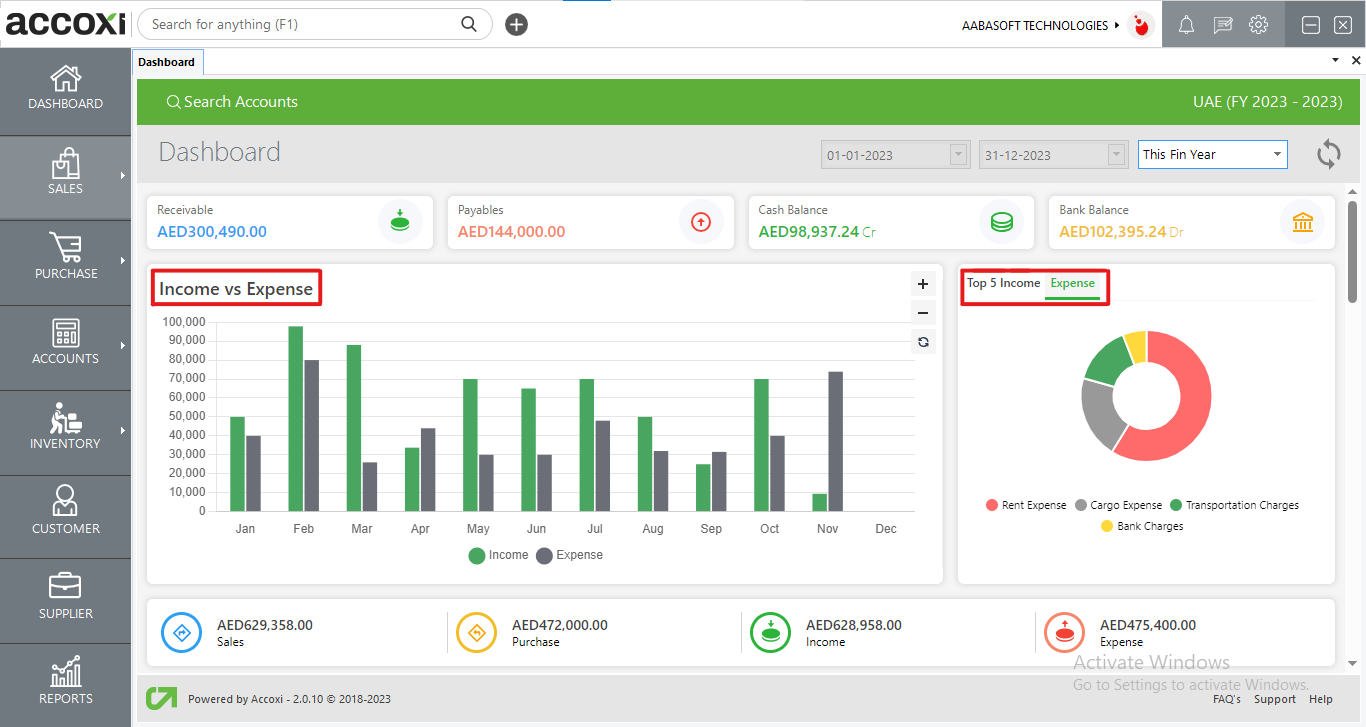
Income/Expenses Graph Chart
|
The dashboard features a column graph chart that provides a comparative analysis of the income and expenditure of the firm over a specific period. This chart visually illustrates the financial performance and trends of the organization. |
|
Sales |
This feature displays the total sum of the organization's sales revenue.
When a user clicks on the "Sales" menu, it directs them to the Sales Invoice page within the Sales Module, where they can access and manage detailed information related to sales transactions.
|
|
Purchase |
This element provides information on the total amount spent on purchases by the organization.
When a user selects the "Purchase" menu, it leads them to the Purchase Invoice page within the Purchase Module, where they can view and manage detailed information related to purchase transactions.
|
|
Income/Expenses Pie Chart
|
The dashboard's pie chart displays the top 5 sources of income and expenses for the organization. Users can view income and expenses separately or together, based on their preference. Time periods can be selected from a menu, and the charts provide a visual breakdown of income and expenses, with the top 5 items highlighted in different colors.
|
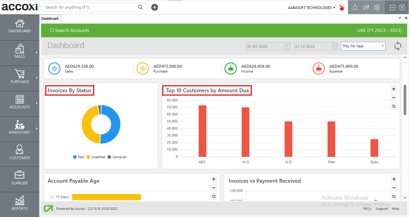
The "Invoices by status" section presents the status of sales invoices, categorized as paid, unpaid, and cancelled, each with its corresponding color code. When a user clicks on a specific status, they will be directed to view a detailed breakdown of the invoices falling under that particular status. This allows users to easily access and manage invoices based on their payment status.
The "Top 10 Customers by Amount Due" feature displays a graphical representation of the top 10 customers who owe money to the organization and have outstanding payments that need to be settled. This provides a quick overview of the customers with the highest amounts due.
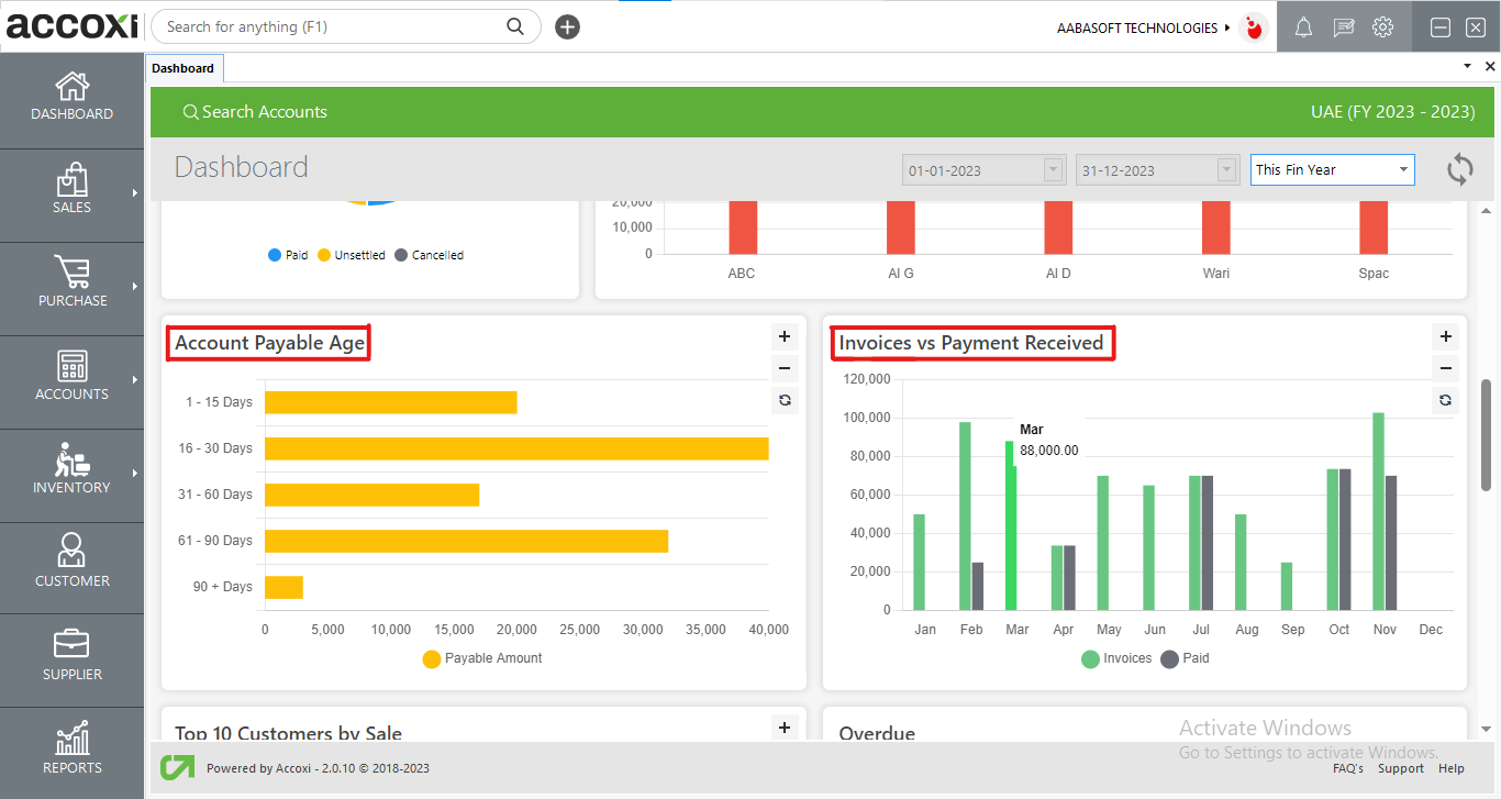
The "Accounts Payable Age Graph" illustrates the total amount that the organization owes to its suppliers. This graph segments the outstanding payables into different time frames, offering a clear and detailed analysis of the organization's financial obligations to suppliers. When a user clicks on a specific part of the graph, they can access a breakdown analysis of the payables within that particular time frame, providing a more in-depth understanding of the financial commitments.
The "Invoices vs Payment Received" graph provides a visual representation of the monthly invoice amounts generated compared to the payments received from customers in response to those invoices. This graph illustrates the total value of the invoices in relation to the payments received, offering a clear and comprehensive overview of the company's financial performance and the effectiveness of its invoicing and payment collection processes.
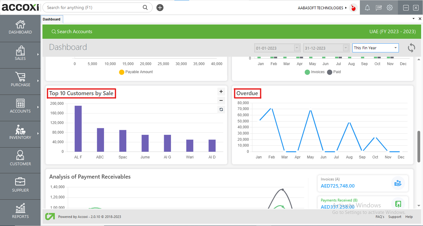
The "Top 10 Customers by Sale" graph depicts the top 10 customers of your organization and the monetary contribution they have made to your sales. This visual representation highlights the organization's most significant customers who have played a vital role in generating income for the company. It offers valuable insights into the customer base driving the organization's sales success.
The "Overdue" line graph presents an analysis of receivables or outstanding amounts owed by customers. This graph displays the receivables for each period, providing a visual representation of the amounts that are overdue or have not been paid by customers in each specific period. This graph helps track and analyze the pattern of outstanding payments over time.
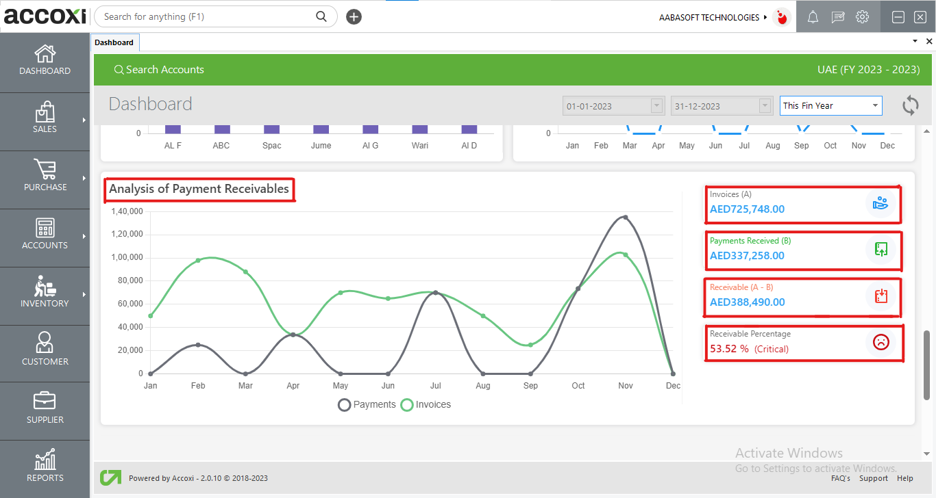
The "Analysis of Payment Receivables" graph provides a comparison of payment receipts from customers, including opening set-off, customer advance payments, and invoice payments, with a focus on invoices alone. Here's a breakdown of the key components:
The indicator system is as follows: